
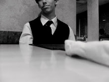
Instead of another profile of my face I decided to do perspective for these...this one focusing soley on my pants, so the two dimensionality of it borders on boring line art. But I like how it turned out...I want to write on the ground, facing the implied body, not the audience,
"What Giants See"

This one I did with my left hand, noteably more challenging. Hence the stupid squiggley lines. But I'm overall proud of it. Comments?
I likes!
ReplyDeleteLooks like Russell's watercolor of pants. I like, but try for different types of thicknesses of line, that's how you get rid of the "boring line drawing quality"..... <3 from Tally
ReplyDeleteI meant to say, different thicknesses of line will get you away from "boring line drawing quality" not "try for' that makes me sound like a self-righteous asshole. Sorry.
ReplyDeleteYou've improved so much!! I'm so proud of you!Especially the drawing a picture with the opposite hand is very good! (Ever thought to write with you right and draw with your left? *would be really confusing to the brain*)
ReplyDeleteThe only critic I would make for the first is to angle the shadows rather than peeking them behind the legs and for the second the legs lost the view from the giant. But overall me gusta! :)